Ubuntu 11.10 Review: Incremental Refinement
As Mac and iPhone users play with their new iOS5 and iCloud, Linux users get to play with a brand new release of the most popular Linux OS. Ubuntu 11.10, also known as Oneiric Ocelot, has arrived.
Unlike the last release, which featured a switch to an entirely new Unity user interface, this one is a fairly incremental upgrade. What most of us expected were further refinements to this new user interface, and Ubuntu more or less delivered on that, but let’s get into the nitty gritty.
Here are the main news:
- Refined Dash with a new music search option, and filters
- Improved Application Switcher with the ability to expand windows of an Application
- Further refined and simplified Nautilus file manager
- Much simpler System Settings panel
- Revamped Ubuntu Software Center.
- Other minor tweaks such as hiding the close, maximize and minimize buttons in full-screen, some new preferences panels etc.
Dash
The launcher didn’t seem to receive any significant improvements aside from the ability to remove an icon from it by dragging it to the newly named “Rubbish Bin”, and a default inclusion of a System Settings icon.
Instead most focus was put on the Dash, which is aside from the Launcher the most important component of the Unity interface.
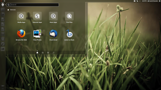
Dash now features a sightly different look, and can be maximized to full-screen, which is a welcome feature I missed in its previous iteration. It now also includes four icons at the bottom which allow switching between application search, files and folders search, and music search. While the first two were possible before, music search makes its debut in this release.
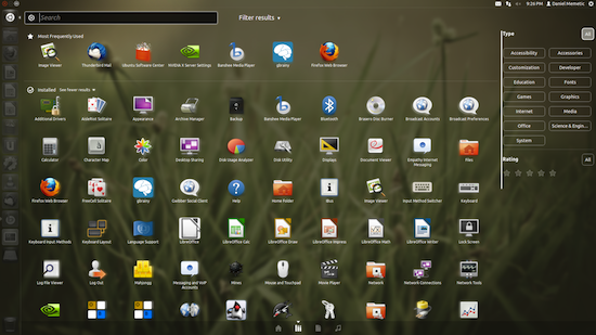
Filters are another major improvement as it allows much greater control over results displaying in Dash. Each search lens has its own filters. Applications can be filtered by type (or category) and rating. Files and folders can be filtered by type, when were they last modified, and by size. Music can be filtered by genre, and decade. And all of these also include an “all” option if you don’t want to filter.
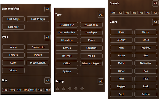
This is a quite powerful way of finding things on your computer, and basically combines desktop search with what used to be offered by a classic menu driven system like the one still being used on Windows. Mac OS X has departed from a classic menu driven system as well, but their Launchpad doesn’t offer any kind of filtering, although Spotlight search with its categorized search results largely makes up for this.
In any case, Dash is unique, and may represent a killer app for those who prefer it over all other solutions. With filters its case is even stronger.
It is not without its quirks though, and there are those who complain about it. Some say it can sometimes take too much work to get to anything. It is great if you know the name of the application or file you’re looking for, but if you need to browse it seems to involve more work than just strolling through the menus.
You need to pick the the lens or switch to the right search type, then make sure you have the right filters selected, and then remember to click to see more results since they’re typically hidden. Then finally you’re hopefully browsing the list of what you’re really interested in.
I suppose this level of control and fine tuning of what you see comes with a trade off, but I can see why some might prefer a simple Programs menu on Windows or a grid of applications in Mac OS X launchpad. If you just want everything on the table to pick from it’s there, and if you want to be more specific there’s search.
It’s ultimately going to be a matter of preference, and this is admittedly a mild complaint, but Dash did evolve in this release into something quite respectable.
Application Switcher
There isn’t a lot to say about an application switcher, and it would be bad if there was. It’s job should be simple, so it should be simple too. The new switcher is shiny, and it allows expanding the view of application windows with an alt-‘ key (just above the tab), which then switches between said windows. It’s a decent way of drilling to the application, and window you need, and it works.
Nautilus
It’s been quite clear for some time now that Nautilus thinks very highly of Mac OS X Finder since it keeps imitating it. As it keeps evolving it keeps getting simpler and slimmer, and that’s what it is in Ubuntu 11.10.
That said, Ubuntu’s new Nautilus does have a somewhat different layout. Instead of putting the toolbar atop both the sidebar and the file view it appears only within the file view, and contains only the back & forth, search, and navigation buttons. There doesn’t appear to be a way to add any new buttons which actually makes it even simpler than Finder itself, albeit less feature full.
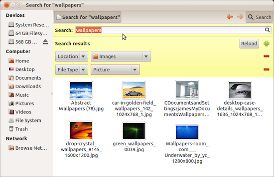
Still, this is a very usable interface. The search button reveals the search bar just below, making it easier to find what you need in a busy folder, and it even allows customizing the location being searched, and file types to be included. Not bad.
System Settings
Ubuntu 11.10 finally puts an end to the tradition of overcrowded System Settings panels, but at the risk of looking like an OSX copy cat. The idea is well borrowed, however, and so the new System Settings is a beautiful selection of the essentials. It even has the search bar to show you where to find a specific setting.
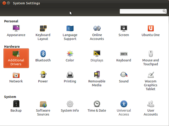
Those who want greater control can still install one of the alternative panels, or utilities such as Ubuntu Tweak, so they’re not completely undercut by this. A simpler System Settings panel fits the direction Ubuntu is going in, and it is a welcome sight.
Revamped Ubuntu Software Center
The Ubuntu Software Center seems to be getting a face list with every new release lately, and the same goes for this one. It now looks like what one would expect a respectable App Store to look like, with a no fuss interface that gets to the point. Top rated and news apps are given a spotlight, but you can always browse for more.
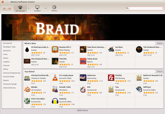
It features three main sections allowing you to browse All Software, Installed software or see the history of all software changes, something that might interest only select few people, but could come in handy. The arrows next to All and Installed software allow selecting software sources, and this is where “For Purchase” makes its appearance.
It has been the goal of Canonical for a while now to facilitate software purchasing in its Software Center, in addition to all the free stuff traditionally provided, and this is another step in that direction. Trouble is, there isn’t a lot to select from, and a good portion of the list is populated by magazine issues, so there appears to be some ways to go before this becomes a vibrant marketplace.
Overzealous Minimalism
One of the “other minor tweaks” in the new Ubuntu is the hiding of the close, minimize and maximize buttons which to me only contributes to a problem created in the previous release.
I would call it “overzealous minimalism”. It is clear that one of the primary aims of Unity is to save as much screen real estate as possible, making it netbook and tablet friendly, but some of the tweaks made to that end just don’t seem to make sense.
As in the previous release, Ubuntu hides the application menus, and now on top of that it hides the close, minimize and maximize buttons of maximized windows. Neither of these elements typically take much horizontal space yet hiding them gives me a kind of uneasy feeling. It de-emphasizes whatever might be in those menus, which often include some quite valuable options, especially as apps get more and more minimalistic.

To see the menus you have to hover over where you expect them to be, and then they actually cover the application title, which makes even less sense when there is plenty of space to the right. It really does not need to cover the application title, and doing so looks quite bad and lazy.
Performance & Stability
I have to say I’ve had better experience with Ubuntu 11.10 compared to 11.04 in terms of stability and performance although I still feel it to be somewhat sluggish in a few places where it doesn’t seem like it should be. The UI also crashed once, but it restarted itself pretty quickly.
One glaring issue that I do keep running into, and which I can’t explain as anything more but a buggy behavior, is with the right click menus on the Launcher icons. They sometimes fail to respond in any way, not registering clicks, and not even being dismissible by clicking away. The only workaround is to click on the corresponding icon again, but that could have the undesirable side effect of launching an application when you don’t intend to.
Apps
As always, Ubuntu comes with a selection of pre-installed applications which are typically expected to be the best of breed, and meant for the most common uses of a computer. Ubuntu 11.10 comes with Thunderbird as a default email client, replacing Evolution which used to be featured previously. Having used Thunderbird before I think this is a very good choice.
The rest is a typical selection including LibreOffice for office work, Banshee for music and multimedia, Gwibber for social networking (Twitter and Facebook), and Empathy for instant messaging, which is nicely integrated into the system’s UI.
Ubuntu Software Center is a one stop shop for applications on Ubuntu, although third party .deb packages exist that can be downloaded and easily installed as well.
One problem that I think most of Linux suffers from, but which is gonna be hard to resolve, is the quality of applications included in the Software Center. It is not uncommon for even the top rated ones to exhibit poor performance, stability or usability, but they are lumped with the rest. As a long time Linux user from a few years ago I still see apps in the Ubuntu Software Center which I know aren’t quite what a new user coming to Ubuntu might expect them to be. They are second rate compared to what is readily available on other platforms.
It is a sad reality that as much as there is great software for Ubuntu, its applications availability problem is still not solved. It might help if Ubuntu put some effort into curating the software selection, and quality control.
Conclusion
Ubuntu 11.10 is a somewhat smoother ride than what I experienced with a previous release, and the improvements to Dash could help sell Unity to those still skeptical of it, but this is clearly a refinement release more so than anything spectacularly impressive.
The good thing is that nothing appears to have taken a step back, even if only few things have taken a step forward. The bigger question is how does it stack up to the competition, and I’m afraid this has a rather stubborn answer. It never wasn’t just about a great look and feel, and an easy to use interface. The underlying subsystems matter. The applications available for it matter. Most of all, when so many things are stacked up against you, being absolutely amazing matters as well.
Is Ubuntu 11.10 “absolutely amazing”? I’m afraid not. It is certainly different, albeit it borrows a noticeable lot from Mac OS X, but there’s hardly anything so extraordinary and disruptive to wow people using Windows and Mac OS X, both of which today have respectable operating systems in terms of security, performance and stability, with quite beautiful and functional user interfaces.
In other words, for the general populace Ubuntu is just adequate bordering on something that could be great, but is great only for a specific niche of people who care enough to bother and don’t miss enough to be frustrated away. In other words, if you’re not missing any applications for the tasks you typically do, and you like the interface, then Ubuntu is great, and this release is a good upgrade.
Otherwise… well… there are stronger options. Linux, and arguably Ubuntu, certainly is the best that it ever was, but so is the competition.


Comments - 13 Responses to “Ubuntu 11.10 Review: Incremental Refinement”
Sorry but comments are closed at this time.