Windows 8: A Little Quirky, But Not So Bad After All

Windows 8 is probably the biggest change made to Windows since Windows 1.0. Sure there were drastic changes in the way the Windows user interface looks and feels, but it always followed the same general concept. With Windows 8 we are getting an entirely new paradigm on top of the old one, and new Windows users land right smack in it when they first boot it up.
In fact, it’s not so much that the new Windows UI lays on top of the old desktop UI; the desktop UI is now just another element of the new UI. It’s just that it’s the one desktop users will be spending the most time in, and the one that still supports far more applications than the new UI.
This drastic change was bound to cause controversy, and it very much did so. Most of it is a result of Microsoft’s very risky and simultaneously very ballsy attempt to bridge the two worlds that many might say cannot be bridged without causing trouble; the world of keyboard and mouse equipped desktop computers and touch screen equipped tablet computers.
Seeing what a lot of people were saying I was among those who held the opinion that this was not the best idea, and that Apple has the right approach, with one OS (OSX) for desktop computers, and one (iOS) for tablets and smartphones. To glue the two worlds together Apple opted to heavily rely on the cloud instead, syncing data, but keeping software to their own appropriate devices.
The Desktop Mode Wins, On The Desktop
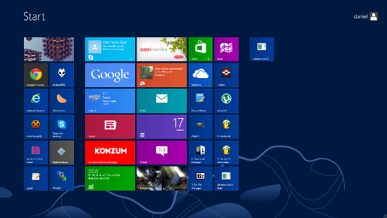
After using Windows 8 for a few days now my general impression is, somewhat surprisingly, mostly positive, but this is not necessarily a vindication of Microsoft’s approach. It is simply down to the fact that as a desktop user I spend most of my time in the desktop “app”, rarely even touching the fancy new UI. As it turns out, so long as you do this, the new UI acts as not much more than a glorified replacement of the old Start menu.
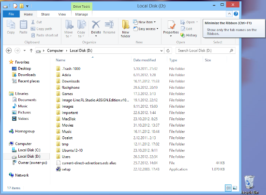
It is worth noting that, so long as a desktop user sticks to the desktop mode, Windows 8 actually represents a significant improvement in user experience and performance. Windows 8 has a lighter hardware footprint and generally appears faster than Windows 8. Its desktop UI gets rid of some of the unnecessary shiny bling giving the OS a more elegant feel, and the often used Windows Explorer gains some welcome features such as the return of the up button and a ribbon-like menus with quick access to commonly used tasks. The taskbar is still there and operates just as it did in Windows 7, without compromise.
As for the missing Start button, I found myself just using the Windows button, which is available on all PC keyboards anyway, and this made me miss the button quite a bit less than I expected I would. The mouse-driven option, moving the mouse to the bottom left of the screen and clicking on the square that appears, isn’t a terrible solution either once you get used to it, but the button would’ve still been better.
It is a bit more difficult to use when in dual-screen mode, and the second screen is positioned to the left of the main screen, since the mouse tends to jump to the other screen. Unfortunately, moving the second screen to the right simply replaces this issue with the issue of making it more difficult to open up the charms menu, albeit the charms menu is somewhat less essential and less often required than the Start menu.
Another notable disruption presented by the new UI on the desktop is the login screen. First time users might be puzzled as to what to do, but it is a trick that only needs to be learned once. Of course, the trick is to drag the nice cover picture towards the top of the screen, revealing the login form.
Other than these relatively minor issues, a desktop user will probably find Windows 8 a surprising improvement over Windows 7. The new UI offers something extra, but it’s extra that doesn’t disrupt the familiar experience, at least not as much as many expected.
The biggest difference is that instead of the old Start menu we get the new Start screen, but this is at worst just a trade off. The new screen offers a bit more flexibility in terms of how you want to order your favorite often used applications, gives more information at a glance through integration with various cloud and social services, and arguably just looks nicer. On the other hand, it takes up the whole screen, and the list of all available applications as well as the way to bring it up (right click and then click on “All Apps”) might not be to everyone’s liking.

Leaving this trade off aside the performance improvements, a more elegant desktop UI, improved file manager, and various other details like the improved task manager, a new simpler Open With box, integration with social, messaging and cloud services for system wide notifications probably make for an improved overall experience compared to Windows 7. Of all these, however, I’d have to count performance improvements the most valuable, especially for people upgrading Windows on older PCs. I know of at least one case where Windows 8 actually made an old computer run faster.
The New UI On The Desktop and The Tablet
Going back to the star of Windows 8, the new user interface formerly known as Metro UI, it is pretty decent as far as simply replacing the old Start menu goes, but for anything beyond it feels more like a gimmick, at least on the desktop. Some apps, such as Music and Videos, don’t seem like any kind of improvement over the traditional desktop equivalents. In fact, they confuse the hell out of me. I couldn’t even figure out how to add music to a playlist, and they are wasting a lot of screen space while offering bare bones functionality. In fact, I think they fall short even for tablet users. I ended up treating these apps as just bloatware I will never use.
I similarly find little improvement when comparing the new Skype app available from the Windows Store to the traditional Skype app. Light on functionality, and similarly confusing. It doesn’t appear to allow selecting any other availability modes except “invisible” and “available”, for example. On the desktop I see no reason to use it over the traditional app.
A few Metro apps that I find remotely useful include News, Weather, Maps, Travel, and Messages, but most of it is due to their cool factor, and actually looking useful out of the box, without much need to figure them out. On the tablet, however, these and other decent apps available from the Windows Store will be quite welcome, and could help Windows 8 become a contender in the tablet space. Apps are essential to that goal.
I’ve had the opportunity to get a hands on a Windows 8 powered ASUS VivoTab RT tablet, and my experience with Windows 8 on it is mostly positive, as should be expected given that this is what the new UI was mainly designed for after all. I still have mixed feelings about the fact you have to swipe from the edges of the screen to get to certain functions simply because this method isn’t obvious to someone using it for the first time, but it does work quite fine once you get used to it.
Obviously, the desktop mode wont perform as well on a tablet as it would on a desktop PC, mainly because the buttons are a little harder to hit. But in some ways, the constant availability of the Metro UI elements helps the touch based use of the desktop even on a tablet. It isn’t quite the same experience as putting Windows 7 on a tablet would have been. It is more of a hybrid, with touch friendly elements available for a few tasks that would otherwise require needle poking small buttons and checkboxes; things like PC settings, changing the volume, and of course launching the applications. While the desktop certainly isn’t, and shouldn’t be, the first class citizen on a tablet, Windows 8 desktop is still more touch-friendly than the Windows 7 equivalent.
Conclusion
The word is that the uptake of Windows 8 since its launch is slow, and that consumers in general aren’t all too excited. Microsoft expected more, but Microsoft probably expected too much. A change like Windows 8 will necessarily take time to digest.
The conclusion I would draw from my experiences, and as a summary of this review is that it is not as bad as many have predicted it to be, that it actually works, even if it does have its quirks. It does offer everything Windows 7 did, the main change being in the style of the Start menu, but it is faster and more elegant. I suppose whether you love it or hate will depend mostly on how much do you mind that new Start menu. Users that might love it the most are simultaneously still a niche; those who like the idea of having a tablet that can perform as a laptop too, and will buy products like the mentioned ASUS VivoTab and Microsoft Surface.
Perhaps the biggest problem Microsoft has with Windows 8 is the perception problem, which will make it hard for people to see past their fear of unknown and initial impressions. When most people take a first look at Windows 8 the first thing they see isn’t the faster and more elegant, arguably even a more powerful desktop OS. Instead they see this new alien UI that we don’t even know what to call yet (since MS retired the “Metro” name and left it without replacement). So those looking to replace their desktop and laptop PCs see something they can’t easily wrap their heads around, and those who might be looking for a tablet just see an alternative to Android and iPad, looking at it with a critical eye that it deserves.
So it’s gonna be a tricky stunt for MS to pull, and even if they are successful it will take time. But I think it has a chance, and as the market continues to turn more towards tablets and hybrids, Windows 8 will have an easier time succeeding.
Unless, of course, Google and Apple eat their lunch first, leaving Windows 8 as only a desktop OS with this alien thing bolted in it.


Comments - No Responses to “Windows 8: A Little Quirky, But Not So Bad After All”
Sorry but comments are closed at this time.